How to Make a Bow Stand Up Properly: Ribbon Craft Guide
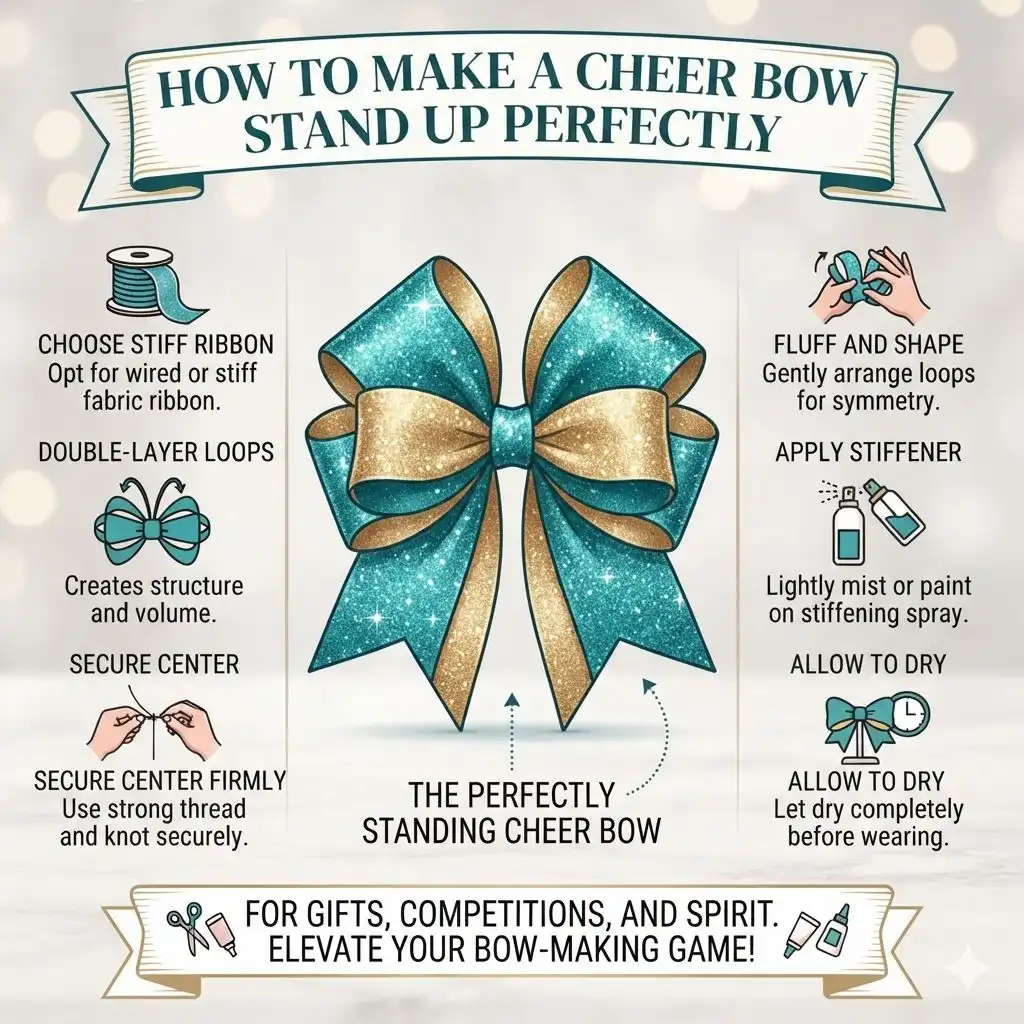
Simply put, creating a standing bow involves selecting the right materials, proper folding and tying techniques, and often incorporating subtle stiffening agents or structural aids to maintain its form and prevent drooping.
Recommended gearAs an Amazon Associate we earn from qualifying purchases. Prices and availability are accurate as of the date shown and are subject to change.

Key Takeaways
- Choose stiff, high-quality ribbon that holds its shape well for a standing bow.
- Master the art of creating loops and securing them firmly in the center.
- Utilize wire or pipe cleaners within the ribbon for added internal support.
- Consider spray starch or fabric stiffener for a natural, yet firm, hold.
- Proper storage of finished bows is key to preserving their upright structure.
What is a Standing Bow and Why Does it Matter?
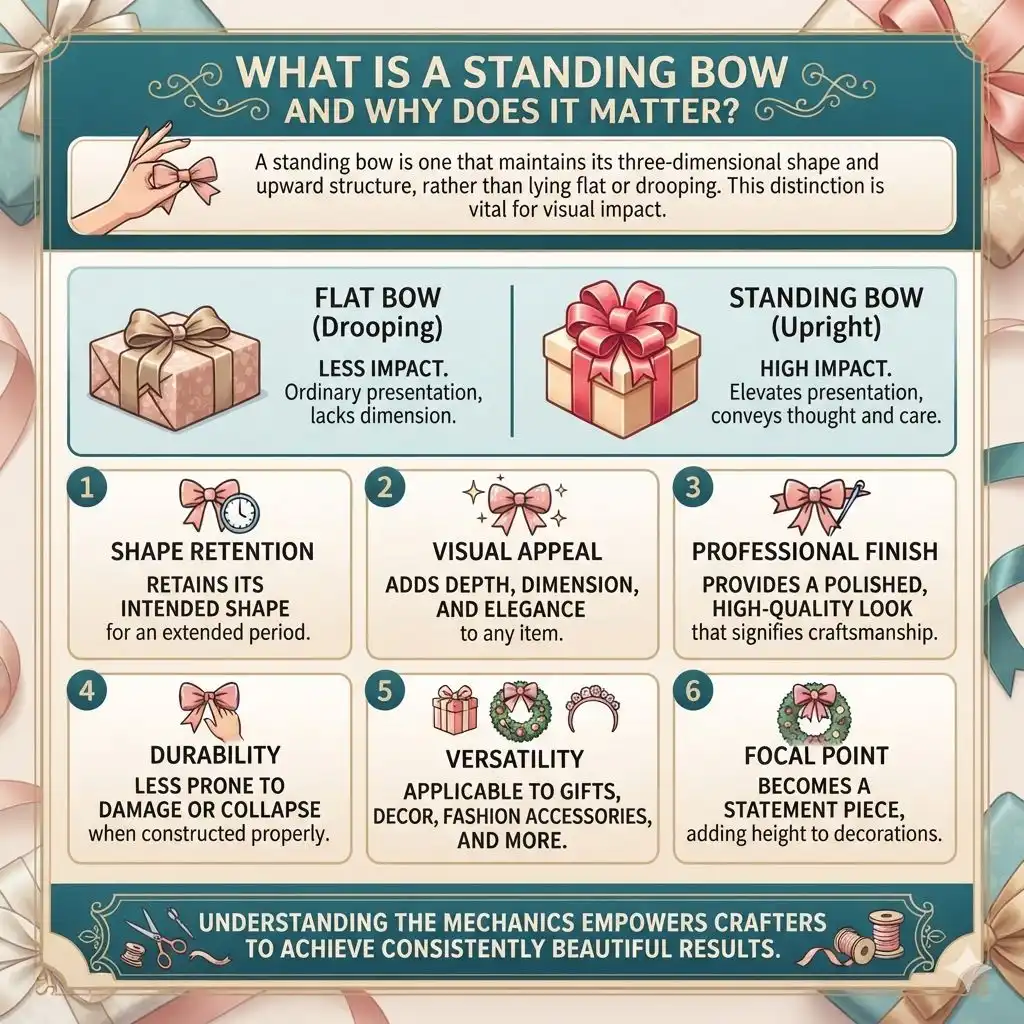
A standing bow is one that maintains its three-dimensional shape and upward structure, rather than lying flat or drooping. This distinction is vital for visual impact. In gift wrapping, a well-formed bow elevates the presentation from ordinary to extraordinary, conveying extra thought and care.
For decorations, like on a wreath or a Christmas tree, a standing bow becomes a focal point, adding height and dimension.
The difference a standing bow makes is significant. It projects a sense of polish and attention to detail that a flattened bow simply cannot achieve. When your projects need that extra flair, a bow that stands proud is the answer.
It’s about creating a lasting impression that resonates with recipients and observers alike, turning a simple craft into a statement piece.
- Shape Retention: The primary benefit is a bow that retains its intended shape for an extended period.
- Visual Appeal: Standing bows add depth, dimension, and elegance to any item they adorn.
- Professional Finish: They provide a polished, high-quality look that signifies craftsmanship.
- Durability: When constructed properly, standing bows are less prone to damage or collapse.
- Versatility: Applicable to gifts, decor, fashion accessories, and more.
Understanding the mechanics behind a standing bow empowers crafters to achieve consistently beautiful results. It’s not just about tying a knot; it’s about strategic construction that prioritizes form and longevity.
Choosing the Right Ribbon for Standing Bows
The foundation of any sturdy bow lies in the ribbon you select. Not all ribbons are created equal when it comes to holding a shape. For bows that stand up, you’ll want to prioritize ribbons with a degree of stiffness and structure.
Wired ribbons are often the go-to choice because the integrated wire provides excellent support and allows for easy shaping and reshaping of the loops and tails.
Consider the material. Satin, grosgrain, and velvet ribbons can work, but their inherent softness might require additional support. Ribbons made from stiffer synthetic materials or those with a woven texture tend to hold their form better on their own.
If you opt for softer ribbons, look for ones that are not too thin or flimsy, as they will be more challenging to make stand upright without collapsing.
| Ribbon Type | Pros for Standing Bows | Cons for Standing Bows |
|---|---|---|
| Wired Ribbon | Excellent shape retention, easy to form loops, wire allows for manipulation. | Can sometimes look a bit artificial if not styled well, wire edges can fray. |
| Grosgrain Ribbon | Structured texture, holds a crease well, good for more classic bows. | Less flexible than wired ribbon; may require internal support for height. |
| Satin Ribbon (Thick) | Luxurious look, smooth finish. Thicker varieties offer more body. | Can be slippery and prone to drooping if not secured tightly or stiffened. |
| Burlap/Jute Ribbon | Rustic texture, naturally stiff, excellent for farmhouse or natural themes. | Can fray easily, may not suit all aesthetics, can be rough to the touch. |
A thicker ribbon, even if not wired, will naturally have more body and be easier to manipulate into a standing shape. Always check the ribbon’s weight and texture before committing to a project where the bow’s structure is paramount.
The Classic Bow Tie Method for Standing Support
The traditional bow tie method, often used for gift wrapping, can be adapted to create a bow that stands up. The key is in how you form and cinch the loops. Instead of a flat tie, you want to create rounded, full loops that have volume.
When you cinch the center tightly, these loops are pushed outwards and upwards, giving the bow its initial lift.
Start by creating two generous loops, making sure they are of equal size. The size of these loops will dictate the overall size and height of your bow. As you bring the two loops together to form the center, resist the urge to flatten them.
Instead, pinch them firmly in the middle, ensuring the loops are held in a slightly upright position. The tighter you cinch, the more stable the bow’s center will be.
Step-by-Step Classic Bow Tie Formation
- Cut a generous length of ribbon, considering the size of the bow you want to create.
- Fold the ribbon in half, then fold it in half again, creating a ribbon bundle with four layers.
- Pinch the center of the folded ribbon tightly. This will form the core of your bow.
- Take one end of the ribbon and wrap it around the pinched center, pulling it snug. This secures the loops.
- Create your first loop by folding the ribbon back on itself.
- Create a second loop by folding the ribbon back on itself on the other side, ensuring it mirrors the first.
- Wrap the tail end of the ribbon around the center again, cinching the two loops together firmly.
- Trim the tails to your desired length and shape (e.g., a V-cut or fishtail cut).
The trick here is consistent tension. If one side is cinched tighter than the other, the bow will be lopsided. Practice this technique with a few practice bows to get a feel for the right amount of pressure to apply.
Tip: For an extra secure center, use a bit of fabric glue or a small dot of hot glue on the back where the ribbon overlaps in the center. Let it dry completely before proceeding.
Incorporating Internal Support: Wire and Pipe Cleaners
For bows that need to stand up exceptionally well, especially in challenging environments or for extended periods, internal support is key. This is where elements like floral wire or pipe cleaners become invaluable allies. These materials can be integrated into the ribbon itself, providing a hidden skeleton that maintains the bow’s desired form.
When using wired ribbon, the built-in wire serves this purpose. However, for softer ribbons, you can insert a separate wire. A thin floral wire, often green or brown to blend in, can be laid along the ribbon before you form the loops.
Alternatively, a pipe cleaner can be twisted around the center point of your bow, with its ends hidden within the loops, offering robust support. This method is particularly effective for achieving dramatic, sculpted shapes.
Method for Adding Wire Support
- Cut your ribbon to the desired length.
- Lay a piece of floral wire (about half the length of your ribbon) along the center fold of the ribbon.
- If using a soft ribbon, you might want to fold the ribbon in half lengthwise around the wire to secure it internally.
- Proceed with tying your bow as usual, ensuring the wire is embedded within the loops and center.
- Once the bow is tied, use pliers to twist the wire ends together securely at the back. You can then trim excess wire or tuck it away.
When using pipe cleaners, the process is slightly different. You’ll typically form the bow loops first, then wrap a pipe cleaner tightly around the center of the formed bow. Twist the pipe cleaner ends together at the back and trim any excess.
This provides a very firm, stable structure that can even allow you to reposition the bow’s elements.
The advantage of internal support is that it doesn’t alter the outward appearance of the bow. It maintains a natural look while providing the necessary rigidity. This technique is a game-changer for larger bows or those intended for outdoor use where wind might be a factor.
Stiffening Techniques for Lasting Shape
Beyond the physical structure of the ribbon and internal supports, you can also enhance a bow’s ability to stand up by using stiffening agents. These products are designed to add body and firmness to fabric, making it more resistant to bending and collapsing. This method is particularly useful for softer ribbons that don’t have inherent stiffness or integrated wire.
The most common stiffening agents are spray starch and fabric stiffeners. Spray starch is a readily available household item that provides a light to medium hold, depending on how many layers you apply. Fabric stiffeners offer a stronger, more permanent hold and are often preferred for projects where the bow’s shape needs to be maintained for a long time.
Always test these products on a small, inconspicuous piece of your ribbon first to ensure they don’t alter the color or texture negatively.
| Stiffening Agent | Application | Hold Strength | Best For |
|---|---|---|---|
| Spray Starch | Spray evenly on ribbon, let dry, apply multiple coats if needed. | Light to Medium | Temporary projects, softer ribbons where a subtle stiffness is desired. |
| Fabric Stiffener (e.g., Mod Podge Stiffy) | Brush or soak ribbon, then shape and let dry completely. | Medium to Strong | Permanent decorations, structured bows, holding complex shapes. |
| Clear Acrylic Sealant Spray | Light mist over the finished bow. | Light (adds a protective coating) | Adding a protective, slightly stiffer finish to finished bows. Can alter sheen. |
When applying stiffeners, ensure good ventilation and protect your work surface. Let the ribbon or finished bow dry completely before handling to avoid smudging or deformation. This step can make a world of difference for bows made from materials like cotton or thin silk.
Important: Ensure your stiffener is clear and won’t discolor your ribbon. Some products may leave a slightly glossy finish, which might be desirable or undesirable depending on your project.
Advanced Techniques for Elaborate Bows
For truly show-stopping bows that need to stand up with flair, consider advanced techniques that build structure layer by layer. This often involves creating multiple sets of loops and tails, then assembling them strategically. Think of creating a multi-tiered bow, where each layer provides support for the one above it.
One effective method is the “boutique bow” style, often seen on hair accessories. This involves creating several loops, often folded and pinched in specific ways, that are then stacked and secured together. Another approach is to use a base layer of a stiffer ribbon or even a cardstock cutout to attach more delicate or softer loops, providing an unseen foundation.
For very large, sculptural bows, a technique similar to origami might be employed, folding and creasing the ribbon to create sharp, stable angles.
Creating a Multi-Loop Standing Bow
- Prepare your ribbon. Wired ribbon is highly recommended for this technique.
- Create your first set of loops. For a classic bow tie shape, make two equal loops and twist them in the center.
- Cut a second, shorter piece of ribbon. Create a second, smaller set of loops and twist them at their center.
- Stack the smaller loops on top of the larger loops, aligning their centers.
- Secure the combined loops by wrapping a thin piece of ribbon, a pipe cleaner, or floral wire tightly around the very center of the stack.
- Add tails if desired, ensuring they are also secured at the center.
- Gently fluff and shape the loops to ensure they stand upright and are visually balanced.
For even more elaborate designs, you can add additional layers of loops or different shapes. The key is to ensure each layer is securely fastened to the one beneath it, creating a cohesive and stable structure. This layered approach allows for complex designs that are both beautiful and structurally sound, enabling them to stand proudly.
Consider using a combination of techniques. For instance, a softer ribbon might be stiffened first, then formed into loops, and finally reinforced with a hidden pipe cleaner in the center. This multi-pronged approach guarantees maximum stability and longevity for your standing bows.
Common Mistakes to Avoid
Even with the best intentions, some common pitfalls can lead to a droopy bow. One of the most frequent mistakes is using ribbon that is too thin or too soft without any form of reinforcement. While beautiful, materials like sheer organza or very lightweight satin can be notoriously difficult to make stand up without support.
Over-cinching a soft ribbon can sometimes crush its natural structure, leading to a flattened look.
Another error is not securing the center of the bow tightly enough. The center is the anchor point for all the loops and tails. If this isn’t firm, the loops will inevitably start to sag.
Finally, rushing the process is a common mistake. Allowing stiffeners to dry properly or ensuring glue is fully set before manipulating the bow is crucial. Patience is a virtue when crafting standing bows.
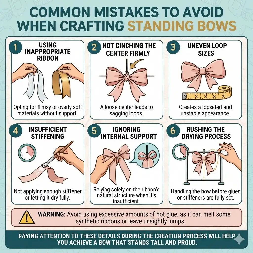
- Using inappropriate ribbon: Opting for flimsy or overly soft materials without support.
- Not cinching the center firmly: A loose center leads to sagging loops.
- Uneven loop sizes: Creates a lopsided and unstable appearance.
- Insufficient stiffening: Not applying enough stiffener or letting it dry fully.
- Ignoring internal support: Relying solely on the ribbon’s natural structure when it’s insufficient.
- Rushing the drying process: Handling the bow before glues or stiffeners are fully set.
Warning: Avoid using excessive amounts of hot glue, as it can melt some synthetic ribbons or leave unsightly lumps that detract from the bow’s appearance. Use sparingly and ensure it’s applied neatly.
Paying attention to these details during the creation process will significantly increase your chances of achieving a bow that stands tall and proud.
Frequently Asked Questions
What is the best type of ribbon for a standing bow?
Wired ribbon is generally the best choice for standing bows due to its integrated wire, which allows for easy shaping and excellent hold. However, thicker, stiffer non-wired ribbons like grosgrain or a substantial satin can also work well, especially when combined with other stiffening or support techniques.
How can I make a bow stand up on a rigid surface like a wreath?
For attaching to rigid surfaces, it’s often best to create your bow with an integrated base or to use a strong adhesive like a hot glue gun or floral wire to secure the center of the bow to the surface. Ensure the bow itself is structurally sound with stiffened ribbon or internal support before attaching.
Can I reuse a bow that has started to droop?
Yes, most bows can be revived. If it’s wired ribbon, simply reshape the loops and tails. For non-wired or softened bows, you might try lightly steaming them to reactivate any stiffening agents or re-applying a light coat of spray starch, then reshaping them while they dry.
How do I prevent bow loops from collapsing inwards?
To prevent loop collapse, ensure you are cinching the center very tightly. If using soft ribbon, consider inserting a pipe cleaner or wire within the loops before cinching, or applying a fabric stiffener to the ribbon beforehand. Making the loops generous and rounded also helps them resist inward collapse.
Are there any natural stiffeners I can use for bows?
Besides spray starch, you can try a mixture of cornstarch and water, or even a thin sugar syrup solution. However, these natural methods may attract pests or be affected by humidity more than commercial stiffeners. Always test them on a scrap piece of ribbon first.
Final Thoughts
Achieving a bow that stands up beautifully is well within reach with the right materials and techniques. By selecting sturdy ribbons, employing proper folding and cinching methods, and utilizing internal support or stiffening agents, you can ensure your bows maintain their shape and add a polished, professional touch to any project. Don’t be afraid to experiment with different methods to find what works best for your chosen materials and desired aesthetic.